Regardless of what you’re writing, be it a blog post, Facebook or Google ad, landing page or even your Instagram bio, a good call to action is essential. Over the years I’ve seen a lot of small businesses trying to advertise and get their name out there, and failing badly. While it could just be a case of bad luck, often their ads, landing pages and more are filled with generic call to actions that even Google’s crawl bots wouldn’t stop to look at.
By adding the right words and images to your CTA, you can command attention and put yourself a cut above the rest. If you’ve never thought about optimising the CTAs on your website and ads, right now is the time to start! Check out our five killer tips for CTA mastery.
Tip Number 1: Know Your Audience
There’s a lot of different types of CTAs, and your audience is going to react differently to each one.
It’s for this reason understanding your audience is the first thing you should be doing, regardless of what you’re writing. If you’re advertising on Facebook, the audience you reach is going to be far different to that of your website. While most of the people that see a call to action on your website’s landing page will have found you by searching for what they need, and are already looking to buy, many of the people you reach on Facebook will have never heard of your brand before.
Before writing your CTA, make sure you know the audience you’re targeting, where your CTA is being seen and why your audience is seeing it. Knowing these things can go a long way to making your CTA not only more relevant to your audience, but also more impactful.
Tip Number 2: Use Hero Images
According to a 2015 study by Microsoft, you’ve got just 8 seconds to capture your audience’s attention. 8 seconds to grab interest and convince them to read your CTA. When it comes to social, the average person’s news feed is full of post ads and pictures all competing for attention.
To cut through the mess, using high-quality, eye-catching images is a sure-fire way to grab someone’s attention. The human brain processes images 60,000 times faster than it processes text, so a great image that shows your audience what you’re selling, be it the value or the product itself, and tells them a little about the ad with some text is a great way to command attention. You can do similar things on your website using the same principles, with banner images and featured images on landing pages and blog posts.
Tip Number 3: Use Language That Inspires Action
No one likes sorting through mountains of text. People’s time is valuable, and most aren’t going to sit around and wait for you sell them something. Take control, and write your hook in a way that shows your audience what to do, and what they get from clicking your CTA. Using action words and phrases such as “Download”,“Buy” or “See For Yourself“, for your CTA button can help improve click rates, and move your audience into action.
What’s most important is that you’re clear in both your intention and your offering. If your audience can’t work out what it is you’re selling, or if what you’re offering in your CTA is different to your website says, your writing may end up having the opposite effect you want. As I mentioned in our other video, using exclamation point can help layer on the enthusiasm and move people, provided your brand image supports it.
This Facebook ad for Shopify is a great example of this. The message is clear, directing the audience to a specific action, all tied together with the CTA button showing that by clicking the ad they can learn how to sell their crafts online. Simple and effective.
Tip Number 4: Provide Value in Everything
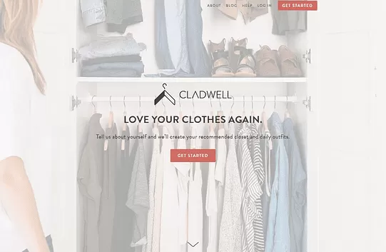
The best CTA’s leave their audience feeling like they’ve gotten value, or will get value, simply out of reading it. Of course, this doesn’t mean you have to turn every CTA into a miniature blog post. Often all it takes is a clear offer to show your audience what they’re getting. Sometimes, the value your CTA provides can simply be finding out about a great new service. Take a look at this landing page CTA by wardrobe planning app Cladwell.
Notice how the bold text clearly shows the value you receive, while the sub-text tells you what the service does, simple and concise. Follow it up with “Get Started” and you’ve got the recipe for a great call to action.
As you’re reading, you find out exactly what you’re getting when you click the button, and you know you’ll be on your way to getting it as soon as you click. That’s not to say you can copy this and see the clicks come flying in. Every business is different, and you’ve got to work out what works for you. Landing page optimisation comes in all shapes and colours, and creating eye-grabbing visuals for your website is going to require a lot of testing and changing.
Here’s a quick test I like to use for my own CTA’s. Read your CTA back, and ask yourself, “Why would I want to click on this? Am I getting anything from clicking this button?”. If you can’t find any good reasons, chances are it’s time to go back to the drawing board.
Tip Number 5: Test Everything
This might seem fairly obvious, but if you want to know what works best, you need to put yourself out there and test your writing. For example, a CTA that gets a good response as a Facebook ad isn’t necessarily going to work on your website, or as a Google Search ad. Things like the text you use, the image displayed and even the colour of your CTA button can all have an impact on click rates and conversions.
A/B testing is a fantastic way to test CTA’s across all your channels. Just take a control version of whatever you’re testing and send it out to half your audience. Then create a modified version of your CTA and send it to the other half. By comparing the success of the two you can see which one has performed better, and implement it in your overall strategy. For some cool examples of how to A/B test your CTAs, check out this article.
Keep in mind, this isn’t going to be a fast fix. You’re going to have to test, test, and test again to find the best possible versions of your call to actions. So get out there and give it a shot!