CSS Grids in Building A Modern Website Layout: Responsive Web Design
Sagar Sethi
05/12/2022
SPREAD THE LOVE!
The most powerful layout method to ever arrive for a modern website layout is CSS Grids. It’s completely altered the way we approach creating a responsive web design. It has many advancements over current tools such as Flexbox. We’ll take a look at just a few in order to understand the CSS Grid and the potential it has in improving your website.
WHAT IS CSS GRID?
CSS Grid is a 2-dimensional system, unlike flexbox that handles both columns and rows simultaneously. In the grid layout, CSS rules are applied to both the parent element (the ‘grid container’) and to the element’s children (which become ‘grid items’).
BROWSERS THAT SUPPORT CSS GRID
The concept of grids has been around for over two decades but only recently has been supported by the following browsers: Chrome, Firefox, Opera, and Safari. So we can see that minus the exception of IE (Internet Explorer), CSS Grid is functionable on the majority of browsers. You can also use the @supports rule to check if a browser supports a property or not and take the necessary action.
HOW TO USE CSS GRID?
CSS Grids allow you to create beautiful layouts with simple math. For example, if we want to create a grid we have to define a container element as a grid with display: grid, set the column and row sizes with grid-template-columns and grid-template-rows, and then place its child elements into the grid with grid-column and grid-row. It’s actually much simpler than it sounds!
Let’s have a closer look at how to make a CSS grid below.
Step 1: Create a Grid Container
Create a class for the container which is going to hold the items. Then include display:grid along with the grid-template-columns attribute. If we want to create 3 columns each with a width of 50px, then we would write grid-template-columns: 50px 50px 50px. Here, instead of giving a specific px value I use auto so that the browser decides the size and it remains responsive. Also using ‘fr’ (fraction) as the measurement value can be another method in making the browser responsive .
CODE:
.container-wrapper{
display: grid;
grid-template-columns: auto auto auto;
background-color:#333333;
padding:10px;
}
Step 2: Assign the Required Style to the Wrapper Item
The next step is to give CSS for the items according to the required style inside the container.
Step 3. Use Grid Gap Property to give Spacing instead of Margin
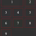
For the final touch up, it is always a good practice to provide some spacing between the items. It is generally done using margins but CSS Grids provides an easier way to do it using grid-gap property. Alter the .container-wrapper by including grid-gap: 1rem. Here is how the above grid will now look!
Result:
WHEN TO USE CSS GRID
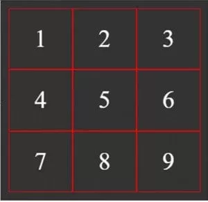
CSS grids are used when you want to target both the row and the column simultaneously. It allows an item inside the container to easily occupy a certain size. For example, if you want number 1 to occupy the first 2 columns, you’d use the following code ‘grid-column: 1/3’. This means number that the 1 will start on column-line 1 and end on column-line 3.
CSS Grid Layout results in a clean markup. All we require is one wrapper which will be the grid and its direct child elements which will be located in the grid cells (HTML elements nested inside the wrapper directly). Therefore, we get an extremely readable and clean HTML markup.
Use what we’ve learnt today to create a more responsive web design and we’re sure you’ll love it 🙂


