The Mobile First Revolution – Learn to Optimise Your Website for Mobile
Sagar Sethi
05/12/2022
SPREAD THE LOVE!
You’ve heard it before and you’ll hear it again, mobile is the future. In fact, the mobile revolution has been happening for a while now. With recent studies showing that 57% of all website traffic coming from mobile, Google announced that all new websites create after July 1st 2019 would be indexed mobile first. “So why should I care?” I hear you ask. Good question!
If you’re creating a new website, Google will crawl the version of your site that gets sent to mobile users first. And if the mobile version of your website isn’t up to scratch there’s a good chance Google won’t even properly consider the desktop version of your website, causing your rankings and your traffic to suffer.
You need to make sure that your website is responsive for mobile. I don’t care what you’ve been told, if you haven’t optimised your website for mobile use, you’re not going to get the rankings you deserve. Period.
Your web design needs to be fluid, adaptive, agile. You need to meet user needs, even if you haven’t specifically designed for each user. Websites don’t last long without a change. Just head over to web archive and take a look at the website designs of big companies like Apple, Nike, or even Xugar’s Digital Marketing website. Most websites don’t go more than a few years without changing design almost completely. Part of this is to keep things fresh, to keep up with design trends and optimise your design for conversions. But the other part of this is to keep up with constantly changing technologies. Or more specifically, mobile devices.
With the influx of new devices, from phones to tablets, desktops and things that are somewhere in between, web developers would have had to create a new website every time a device different specs came out. It would have been a nightmare had things stayed that way.
Enter Responsive Web Design.
Somewhere along the line, in the early 2010s, some smart cookie decided we should be creating websites that automatically reshaped and resized themselves to cater to the myriad devices that people were using. Initially, the approximate screen sizes had to be entered manually to created different versions of your website that switched automatically depending on the device’s screen size (@media queries for the DIY enthusiasts out there). Each element on the page recreated for each version of the website, along with icons, images and other bits.
Thankfully these days there are responsive website builders that do all the code for you automatically. It makes it easy for you to create a website that is compatible with all devices, and enables your website to be easily used. But easy doesn’t mean lazy. There are several other things you need to take into consideration when designing for mobile.
As I mentioned earlier, you should be designing for mobile-first. Put your users first and design in a way that makes it easy to understand the flow and structure of your page. According to Google, responsive design at a basic level is: a single set of HTML code (your website’s content) that is served to all devices (your users) by altering its rendering using CSS code (your website’s design).
At a basic level, the CSS code that you use for design should adjust your website’s content to fit the pixel width of every device that accesses it, providing a consistent user experience. Now there are two halves to having a responsive website. First is getting your content to fit the screen size. This used to be called “Mobile Friendly” design, and all it did was squash your website into the mobile screen size. That way you get to zoom, scroll and struggle your way through the website. Nowadays, responsive builders will automatically resize the visual elements on your website (text, images, buttons, etc.) to eliminate the need for zooming and scrolling. Handy, right? This kind of responsive design is the first half of building a responsive website.
While it’s all well and nice to have a website that fits neatly into your phone’s screen, you also need to take into consideration the second half of building a responsive website, something we’re going to call “User-Centred Design”. At its core, user-centred design is all about making your website as easy as possible to use. There’s a lot that goes into this, and a number of things that overlap with design, but understanding how your users interact with your website, and building around that, is the best place to start.
There are three areas you need to look at to make sure your website is ready for mobile.
1. Optimise Your Website for Users First
Unless you’re hard-coding your website from scratch, most responsive website builders and content management systems (CMS) will automatically resize your content for mobile. Unfortunately, they don’t take into account how people use your website, and how your content actually looks on mobile. That side of things is up to you. Think about how your users will be using your website. Do you need them to see certain information? Maybe your users come to your website to book in for your service? You want your website to be easy to use in mobile view so that your users can quickly do what they want to do.
Start by optimising the text on your website. In mobile view, text can often clutter up the page, especially if you have a lot of it. As everything gets squished and shaped for mobile, a paragraph can quickly turn into an insurmountable obstacle for users. Text needs to be resized to fit mobile screens, otherwise it can be incredibly hard to read simply because it takes up so much space on the screen. Go through the content on your pages and hide all the content in mobile view that seems unnecessary, and shrink everything else. If you’ve got sliders or link banners with lots of text, it may be worth your time to re-write sections to fit, or even remove the text completely.
When it comes to images, the principle is fairly similar. Make things smaller, shrink them to fit, and remove the images that seem unnecessary. Like usual images are fantastic to stop the never-ending scrolling through text and make your website more interesting to browse. Use them where necessary to break up big chunks of text and create spaces where your user can take a break from the reading. Balance is everything. Too many images and things will look cluttered. Too few and your text will do the same.
A great trick you can use to reduce the space images take up is to turn them into a slider. This lets you keep the images for people wanting to look at them while letting the people that care less simply scroll past. Win, win. It’s important to remember that mobile screens are smaller and used differently when compared to desktop. Having a screen much closer to your eyes opens up opportunities to change things drastically to suit mobile. You can reduce the size of text and images quite a bit before it becomes impractical, so don’t be afraid to change things up a lot!
Ultimately, you want users to be able to get where they want and achieve their goals in a single click. Make sure there are mobile optimised “click to call” buttons on every page, relevant and popular links on the home page, and implement other single click functions that will make your website as simple to use as possible. Overall, your job is to eliminate any issues your users might have with navigating your site, such as having to zoom, scroll too much, scroll sideways, as well as unnecessary steps they need to take. Follow that philosophy and you’ll do fine.
2. Max Out Your Website’s Loading Speed
The speed of your website is a major ranking factor these days, and one of those things that’s suuuper noticeable if it’s bad. We all know that attention spans are getting worse and worse. You may even be able to see it in yourself (Shocking, I know)! In fact, one of the reigning factors impacting website bounce rates is how long a website takes to load. Any more than about 3-4 seconds and most users are outta there! 38% of them after just 5 seconds, to be exact.
When it comes to mobile optimisation, having a fast website is essential. Most mobile users are simply looking for fast information. Perhaps they’re out and about and looking for the closest store, or maybe the fate of the world depends on how fast they can find and buy a hat for their cat. Ok, maybe not… but my point still stands! If you haven’t already, you need to be optimising your website for load times. Thankfully there’s a whole bunch of ways you can do this, and it’s not (usually) difficult to do.
The first thing you’ll want to do when optimising for load speed is jump over to either Pingdom or GTMetrix. Both these tools allow you to put in your website URL and get a complete rundown of how long every part of your website is taking to load. It’s great of narrowing down what you need to work on, and understanding why people are leaving your website without even looking at anything. GTMetrix also offers several other website analysis functions, but that’s a topic for another time.
Once the analysis is complete, you’ll want to look at the different things that are loading, and home much time each one is taking. If there’s a large chunk of time where the server is “waiting for a connection” you may have a problem with your hosting or the code on your website. These tools will also show you the size of page and backend elements, and how long they’re taking to load. Now, while you won’t have a perfect idea of what’s slowing your site, these tools are a very good start, and will definitely point you in the right direction.
For many websites, large files and bad code are two of the main things slowing down load speed. If you’ve got large files on your website, going through and deleting ones you don’t need should always be your first step. Next, compress all your images and optimise the file size so they’re faster to load. If you’re using WordPress, plugins like Smush make this very simple.
As for bad code, the issue that a lot of sites face is having too many Javascript or CSS files loaded. Using a plugin like Autoptimize (for WordPress), you can minimise the files and combine the code into single files rather than having the browser pull bits from lots of files. Doing this can drastically improve page load time, but be careful. Combining JSS and CSS files badly can break your website.
3. Technical Optimisation
While this can be a bit more complicated, optimising and cleaning up your website’s backend is going to make things far easier for you down the line. Imagine a website that works flawlessly, delivering a seamless web experience for all your users. Technical and backend optimisation are essentially more in-depth treatments for the mobile optimisation problems mentioned above. These tactics will speed up your website, help mobile users to find your website better, and eliminate a number of the problems mobile users have with websites.
Compatibility Issues
A great place to start is to load up your website on your smartphone and compare it to your desktop version. Note how long it takes to load and if any elements don’t load at all. Most modern smartphones can’t load flash videos and animations, and may struggle with Javascript depending on what it is. Replacing the flash elements on your page can help improve user experience, and may even boost your rankings. While you’re at it, you must make sure every part of your website works on mobile. If your website is relying on something that mobile users can’t see, you’re sacrificing your traffic.
While we’re on the topic of website loading, there are several things you can do in your backend that will improve your load speeds and make things run smoother for mobile users.
Leverage Browser Caching
If you’re leveraging your browser caching, it usually means you’re specifying how long web browsers should hold on to (cache) images, CSS and JS stored locally. This can help improve page load times, if the user has visited the website before, and is generally good practice for improving user experience. You can change the length of time in your website’s .htaccess file, under ExpiresByType.
Dynamic Serving
Dynamic serving allows you to display different versions of your website to different devices. Where responsive design serves the same code formatted differently, dynamic serving sends different code mobile and desktop devices. Now I know I mentioned earlier that creating a different web page for each different mobile device was not the way to be doing things, but don’t pick up your pitchforks just yet. Dynamic serving is simply a way of ensuring that mobile devices get an exclusively mobile site when it’s called for. If you’re removing or drastically changing the elements of your page from desktop to mobile, this method of serving can make it simple to differentiate between the versions of your website and keep your code clean. Combining both responsive design and dynamic serving can let you create a clean version of your website that is exclusively for mobile. It is a lot of unnecessary work though, so not many do it.
Parallel (or Separate) URLs
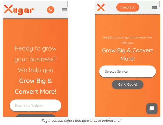
Similar to dynamic serving, parallel URLs send different versions of your website to different devices, attaching different code to different URLs. It’s the older brother of dynamic serving and isn’t used much anymore, but it does still have its applications. Most websites these days opt for a fully responsive designed website, as it is the easiest and cheapest to set up. Websites with parallel URLs will usually be displayed like xugar.com.au and m.xugar.com.au.
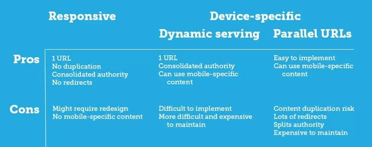
This chart from Moz does a great job at explaining the pros and cons of each type of mobile webpage serving:
Local search, as mentioned earlier, is a big part of mobile optimisation. If someone’s looking for your business, and you want them to find you locally, you’re going to need to implement ways people can find you. The easiest thing you can do in your backend is to optimise your meta titles and meta descriptions for mobile and local searches by placing location names in them. The other thing you should be doing is making use of structured data, and schema mark-up. This data shows Google your name, location, pricing, review status and much more, and can be used to display certain relevant information in the SERP and appeal more to local and mobile users.
Where to From Here?
Mobile optimisation is one of those things where doing a few small things can have a big impact, but if you really want to get the best you could spend hours, upon hours, upon hours optimising your website. Regardless of how much time you spend on it, mobile optimisation is essential if you want to rank your website at all.
The tips in this article should give you a solid place to start if you’re looking to optimise your website yourself, and put you on the right track. And as long as you’re targeting the main areas of mobile-friendliness, that’s responsive design, image and text optimisation, plugin and theme optimisation, site speed and user-first design, you’ll be well on track
If you’re not sure where to start with your website, Google’s put together a fantastic tool that will let you see exactly how your website looks on mobile, and understand which areas need fixing for it to be mobile-friendly. Google Analytics also has a section called “mobile usability” which will give you a look into what elements of your site Google doesn’t like. From there the ball is in your court, so get out there and give it a shot!
Let us know if any of these tips helped you, and if there’s anything we missed!


