One theme in the digital landscape's ongoing saga has become unmistakably clear — the age of mobile dominance. As cellphones become multipurpose tools for mobile web design, they are influencing the way web designers create user experiences.
The shift from a desktop-centric to a mobile-first design paradigm is an evolution that mirrors our lifestyle changes. Data doesn't lie — statistics show a surging trajectory of mobile internet usage, compelling web developers to rethink web development.
The Importance of Mobile-First Design
But what sets mobile-first design apart from mere responsive design? It's the approach — proactive rather than reactive. This strategy starts with the smallest screen, ensuring every user interaction is intentional and purposeful.
This philosophy is revolutionising SEO and we as an SEO Agency are keeping an eye on it, with Google's mobile-first indexing tipping the scales in favour of mobile-optimised sites. More than just a technical necessity, it's a gateway to seamless mobile user experience, with swift load times and a focus on accessibility that's expected.
Best Practices in Mobile-First Design
Making the decision to prioritise mobile users over desktop users requires careful attention to detail as you zero in on features that work best with touchscreens and fingers rather than mouse clicks. The foundation of this method is user-friendly design that the fingertips can easily navigate.
Prioritising content for smaller screens: Less is more when it comes to mobile devices. Content must be refined to its most vital elements, presented not as a diminished version of the desktop experience but as a standalone canvas tailored for the mobile user.
This involves rethinking navigation to deliver a hierarchy where core information is accessible with minimal interaction, leveraging collapsible menus and streamlined options that cater to mobile users' on-the-go nature.
And these optimisations also help in SEO and improve the ranking of your pages because easily accessible links improve user experience, the flow of link value from one page to another, help users understand the context & hierarchy of pages/content and this also makes it easier for search engines to crawl the pages.
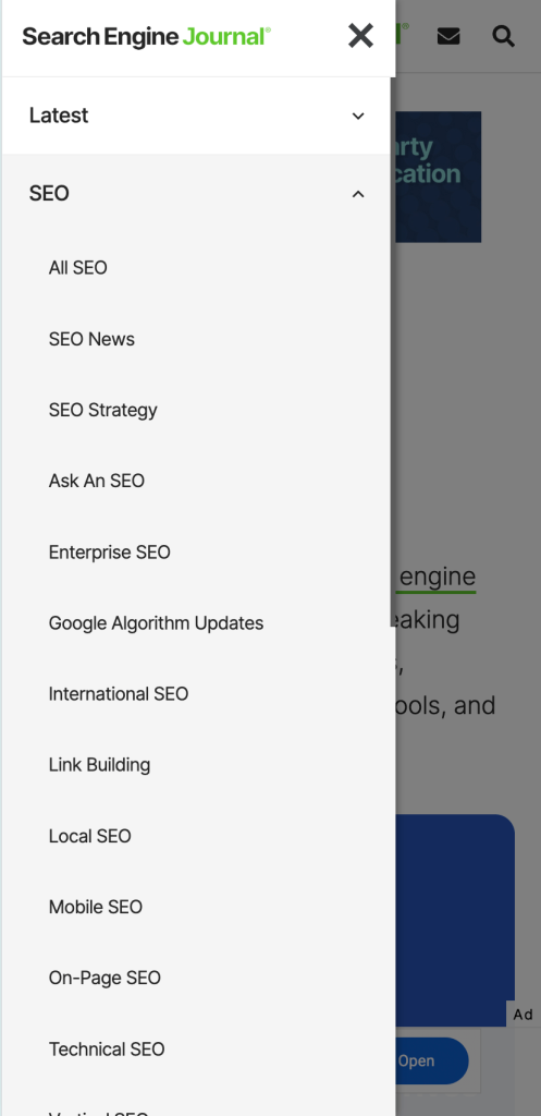
Even one of the largest SEO news site, Search Engine Journal, in the world uses hierarchical menu on Mobile.
Designing for touch: The interface of mobile devices demands specific sections that accommodate varying touch targets. Buttons and links must be sized for fingers, not cursors, ensuring a touch-friendly environment. Generous spacing and a strategic layout prevent the frustration of mis-taps, enhancing the flow of interaction and making sure that users don't need up clicking on something which they don't want to.
Adapting to varied screen sizes: In the ever-expanding gallery of devices, responsive design is just the starting point. Fluid grids, flexible images, and media (video or images) must adjust to the different screen sizes, ensuring a cohesive experience. From the smallest smartphone to the largest tablet, content must fluidly adjust to different dimensions, keeping readability and navigation at the forefront.
Minimalist design principles: Minimalism in mobile-first design isn't simply an aesthetic choice — it's a functional necessity. It calls for a clean interface which is devoid of unnecessary elements that could detract from the user's primary objectives. Each design element must justify its existence, contributing to the site's overall usability rather than merely its appearance. This is important for SEO as well - ensuring that pages don't have unnecessary UI elements or content and therefore are helpful to users.
Which as a full-service digital marketing agency is important for us, because as our Founder Sagar Sethi says all digital marketing services need to be combined for ensuring digital success of businesses.
The test of reality: Simulators and emulators serve a purpose but are mere shadows of the real thing. Testing on devices enables designers and developers to experience their sites as users do. It's the crucible where theory meets practice, revealing issues that might not surface in a simulated environment.
Live testing is essential to understand edge cases in performance and interaction that could make or break the user experience. That's why at Xugar we do live testing before making change live on the sites, this may delay the launch process by a day or two but its something that is definitely worth it because neither you nor we want your users to be in a situation where can't easily navigate around or in some cases can't complete the purchasing of your products.
Consistency across devices: Consistency becomes key as users often switch between devices even myself usually use 2 devices - my Macbook and iPhone, sometimes I start to search something on my mobile and continue to look for it on my laptop that's why due to users constantly juggling between different devices its important to ensure that your site is both accessible & easier to use across different devices.
A site that adapts well but loses its branding and functional touchstones between desktop and mobile users, significantly dilutes the brand identity - consistency of that is important to ensure so that your brand is recognisable everywhere whether it be different screen size devices or even different social media platforms.
But for that, you need to focus on strategic social media marketing and make sure that the same web design elements, colors, fonts, and brand message are getting communicated to users throughout your digital presence. But all this starts from making sure that your website is consistent across different devices.
Ultimately, mobile-first design is about creating an ecosystem that feels native to fingers and thumbs, where each swipe and tap seamlessly translates into action. It's a design philosophy that doesn't just respond to the limits of smaller screens but embraces them as an opportunity to innovate and improve the user experience.
Tools and Technologies for Mobile-Optimised Websites
Crafting for mobile-first doesn't mean going at it alone. A suite of frameworks and tools is ready, with Bootstrap's grids, Angular's dynamism, React's component-based architecture, and Vue.js's intuitiveness. With the correct CMS that offers mobile-optimized themes, responsiveness goes from being an option to being a foundational feature.
To improve performance, Google's suite is the guardian of mobile optimisation. It includes tools like the Mobile-Friendly Test and Lighthouse.
Future Trends in Mobile Web Development
The mobile web is entering an exhilarating phase of transformation, pushed by the relentless pace of technological advancement. Let's delve deeper into the technologies shaping the future of mobile web development:
The Rise of Progressive Web Apps (PWAs)
PWAs are leading the way, seamlessly transitioning between web pages and native apps. They bring the best of both worlds — the broad web reach and the rich experience of native apps. Users can add these apps to their home screens, receive push notifications, and even access them offline. For developers, this means using service workers and cache APIs. They use these tools to make apps that work regardless of the network. They ensure functionality even in the most remote or unstable places.
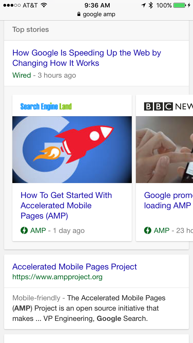
The Speed of Accelerated Mobile Pages (AMP)
AMP is another game-changer it was introduced by Google back in 2015. It is designed to streamline pages to their core components, allowing them to load almost instantaneously. This open-source initiative embodies the essence of mobile-first design—speed and user-centricity. AMP pre-renders content and loads resources quickly.
This ensures that users wait less and engage more. 5G technology is becoming more widespread. AMP's role may change, but its principles of efficiency and speed will stay crucial.
Also I asked our SEO Specialists about history of AMP and if it currently in 2024 has any impact on ranking or SEO performance of different websites in Google's Search Results.
Here's what he said When AMP was initially launched back in 205 there was some speculation that implementing AMP on pages may lead to the preferable ranking and therefore more visibility in different Google's surfaces, later in Feb 2016 Google launched AMP pages for Top Stories - just in Mobile Search Results and at the same time an AMP Logo in Top Stories cards, 'mobile-friendly' before start of meta description was launched.
Later in May 2020 Google announced (not launched) page experience update and with that comes annoucement - when page experience update goes live June 2021 the requirement of using AMP pages to show up in Mobile Top Stories will be dropped and that did happen.
Pages without AMP started to show up in Mobile search results, decreasing the edge that AMP pages have - this also lead to more publishers (who weren't using AMP) to show up in mobile top stories.
With this page experience update, Google's recommendation that site owners should focus on providing good page experience which involves good Core Web Vitals, serving pages in secure fashion (aka using HTTPs), is the content display well on mobile to do this our web team can jump on and help you develop pages that display well on mobile.
This rollout of page experience factors acted as final nail in coffin of AMP (now even Google's SEO documentation says that AMP is not a ranking factor) and site owners (& SEO Experts) stopped focusing on AMP rather primary focus shifted to building quick loading pages, providing better page experience even if it meant using javaScript or other web development platform like Shopify or WooCommerce for developing eCommerce sites.
Artificial Intelligence as a Design Partner
AI is moving from a back-end role to a front-end phenomenon in mobile web development. Machine learning algorithms are beginning to influence design decisions, offering personalised content curation that adapts to real-time user behaviour.
AI can analyse a user's interaction patterns to suggest relevant content, predict search queries, and even preempt navigation routes. We at Xugar are also adopting AI to make sure that we can offer our clients the best service so that they can compete & stand out amongst their competitors.
Automation in Optimisation
Beyond personalisation, AI is automating the optimisation process. It can now do A/B testing at scale. It tweaks designs in real time to get the best user engagement and conversion rates which of course is crucial to convert users who are visiting your pages, AI-driven analytics can find user frustration points.
This lets developers refine the UX nonstop and improve the conversion rate, also one of amazing aspect of our web team is that we can do a specific Conversion Rate Optimisation (CRO) audit that specifically highlights opportunities to improve pages so that more people convert and now our these audits are getting super charged with AI.
We're able to deliver audits in short span of time do CRO testing on both Mobile, Desktop and that too consider range of screen sizes and implement our recommendations quickly as well ensuring that you get maximum value out of people who are visiting your pages.
Augmented Reality (AR) and Mobile Web
Augmented reality (AR) is starting to make inroads into the mobile web, providing immersive experiences that overlay the digital world onto the actual one. From virtual try-ons to navigational aids superimposed on the user's surroundings, AR has the potential to transform the utility and engagement levels of mobile websites.
Even recently on 25th March - Googel added 3D models markup for product structured data so that site owners can easily link their product page and where 3D model of that product is hosted so that it can be shown in Shopping tab of Search Results.
Back on 2nd Feb this year, Apple also launched their VisionPro headset which is combined augmented reality (AR) and virtual reality (VR) device.
Big companies are focused on building AR and VR specific products because that's the future of consumer goods and we as a digital marketing agency also recommend to focus on it and adjust your website accordingly.
Adaptive Interfaces with Biometric Inputs
Biometric technology is not just for unlocking your phone. It's paving the way for user interfaces that respond to the user's physical reactions. These include gaze direction, facial expressions, and even heart rate. This bio-responsive design could start a new era. It will be of personalised and empathetic user experiences.
Mobile web development's future is not just about adapting to smaller screens. It's about predicting user needs and using new tech to make more interactive, personal, and engaging experiences.
As we embrace these innovations, the mobile web becomes not just a platform for content but a dynamic space that understands and reacts to the user, making every interaction intuitive and delightful.
Mobile-First Web Development with Xugar
One thing is clear as I draw to a close on our insights about mobile-first design, this isn't a mere footnote in the history of web development. It's the story of adaptation, of meeting users where they stand, smartphone in hand.
The call to action is clear for businesses - Adopt a mobile-first mindset and align with the mobile user's journey. It's a commitment to today's digital user experience and help your business align with this, we are here to help - contact us today for developing websites which are mobile first - Book a meeting Xugar's Web Development team.
Our SEO team is amazing, if your a business based in Melbourne (or even Australia) and looking to grow your business through SEO - do reach out because we're the best SEO agency in Melbourne.


